![Headshot of the client associated with the [Lancer agrico] project by Zero Designs](https://www.zerodesigns.in/assets/uploads/2025/03/06-Swapnil-Patel.webp)


A Complete Guide to Brand Guideline
WRITTEN BY

Rakesh Raval
Creative Director
Brand guidelines define how your brand looks, feels, and communicates across all platforms. They ensure consistency in visuals and messaging, helping your business appear professional, recognizable, and aligned at every touchpoint.
- Brand guidelines are a practical reference document — not just a design deliverable — used by anyone producing materials on behalf of your brand.
- A complete set covers six core elements: logo system, color palette, typography, imagery style, brand voice, and digital and print usage rules.
- Consistency in visual identity design builds recognition over time — and recognition is one of the most valuable long-term brand assets a business can develop.
- Digital and print environments have different technical constraints and both need explicit, separate documentation within the same guidelines.
What Are Brand Guidelines?
Brand guidelines are a set of rules that define how a brand’s visual and verbal elements—such as logo, colors, typography, imagery, and tone of voice—should be used across all platforms. They act as a central reference to ensure everything your brand creates remains consistent, professional, and easily recognizable.
Think of them as an instruction manual for your brand. From social media posts to brochures and websites, guidelines help maintain a unified identity. They are valuable for businesses of all sizes, especially when multiple designers, agencies, or teams are involved.
💡 DID YOU KNOW?
Consistent brand presentation across platforms can increase revenue by up to 23%, highlighting the direct impact of brand guidelines on business growth.
Why Are Brand Guidelines Important?
Three core outcomes drive the value of maintaining clear visual standards for your brand:
Consistency
Every touchpoint your customer encounters — from your packaging to your email signature — contributes to their overall impression of your business. When these touchpoints look and feel aligned, your brand comes across as organized, trustworthy, and intentional. Without a documented reference, even small decisions — like which shade of blue to use or which font to pick — get made differently by different people each time.
Recognition
Recognition is built through repetition. When your logo, colors, and typography appear consistently across materials, customers begin to identify your brand at a glance — without needing to read your name. This visual familiarity is one of the most valuable assets a brand can build over time, and it only develops when the visuals are applied consistently.
Trust
A polished, consistent visual identity design signals that your business is credible and professional. Customers may not consciously notice good branding — but they absolutely notice when something feels off. Inconsistent or poorly applied visuals can quietly undermine confidence in your product or service, especially in competitive markets.
What Should Brand Guidelines Include?
A thorough set of guidelines goes well beyond a logo file and a hex code. Here are the key components that should be documented:
Logo System
This is more than just your logo file. A complete logo system defines the primary version, horizontal and stacked lockups, the standalone icon mark, color variations (full color, black, white), minimum size requirements, clear space rules, and a list of prohibited uses — such as stretching, recoloring, or placing the logo on clashing backgrounds.
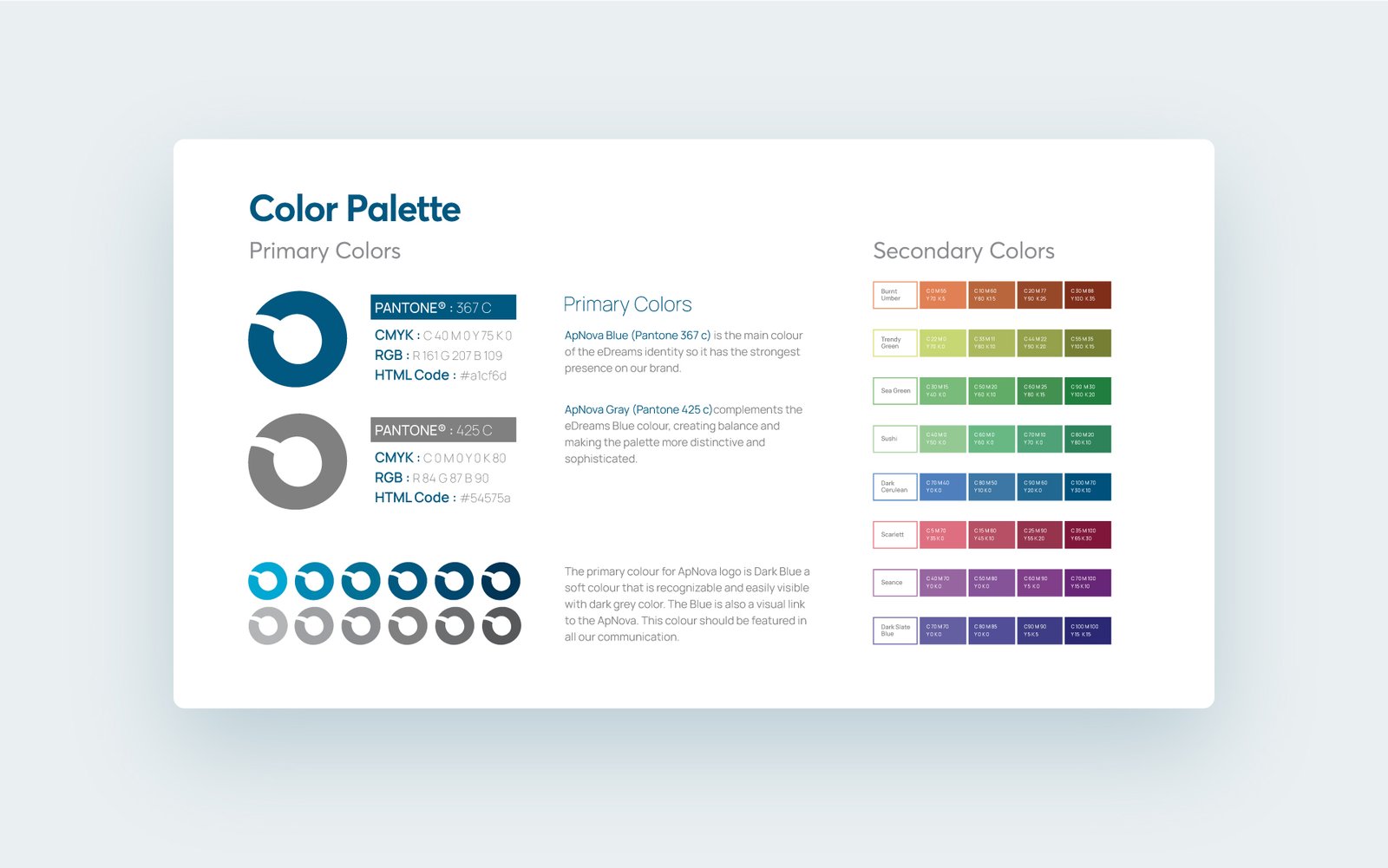
Color Palette
Define your primary and secondary colors with exact values: hex for digital use, CMYK and Pantone for print. Specify which color combinations are approved and which are off-limits. A clearly documented color system removes guesswork for in-house teams and external vendors alike — and protects the visual identity from drifting across different production environments.
Typography
Document which typefaces are used for headlines, subheadings, body copy, and captions — and in which contexts each applies. Include font weights, sizes, and line spacing guidelines where relevant. Typography is one of the most frequently misapplied elements in brand materials, so clear rules here save significant back-and-forth in every creative review.
Imagery and Illustration Style
Define the visual style of photography your brand uses — whether that’s bright and lifestyle-oriented, clean and minimal, or warm and editorial. If your brand uses illustrations or icons, document the style (flat, line, filled, outlined) and tone. This section ensures that images sourced by different team members or agencies still feel cohesive when placed side by side.
Brand Voice and Tone
Visual identity design and verbal identity must work together. Your brand voice — whether it’s authoritative, friendly, conversational, or clinical — should be documented with real examples of on-brand versus off-brand copy. This makes it usable by copywriters, social media managers, and anyone writing on behalf of the brand.
Digital Guidelines vs. Print Guidelines
The same brand needs to work in two very different production environments — and what works in one doesn’t always translate directly to the other.
Digital Guidelines
Digital guidelines cover how the brand should appear on websites, social media, email, and digital advertising. This includes responsive logo behavior, approved social media templates, color values in dark mode, minimum logo sizes for screen, and guidance on digital typography and image formatting.
Print Guidelines
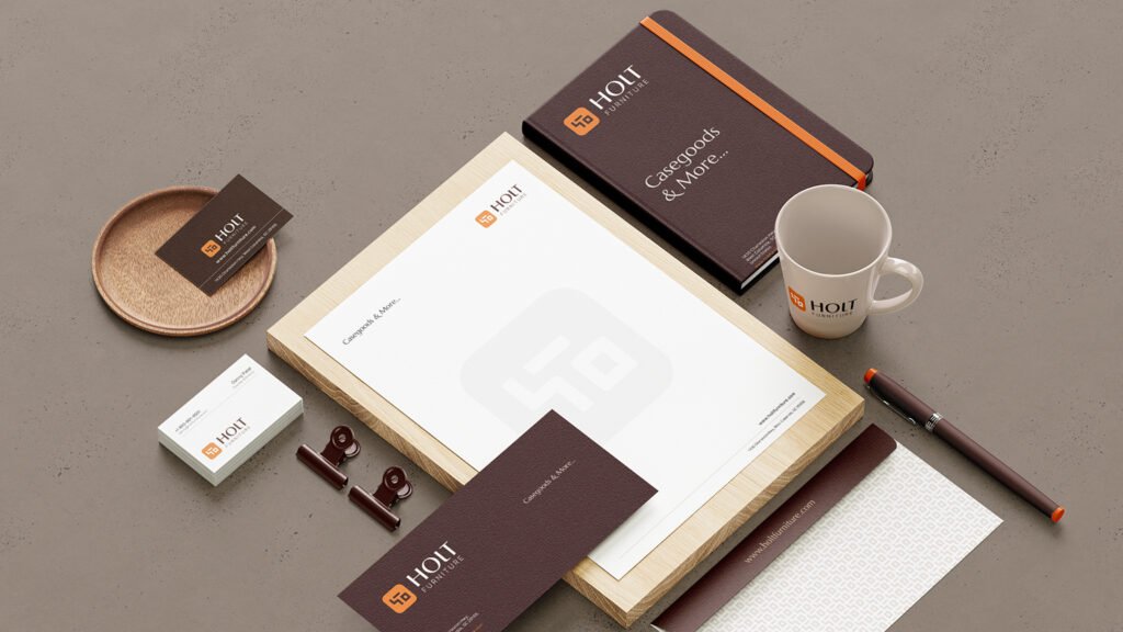
Print guidelines address business stationery, brochures, packaging, signage, and event materials. They specify production-ready color values (CMYK, Pantone), bleed and margin requirements, approved file formats for print vendors, and how the logo and other elements should be applied across physical materials.
Brand guideline example:
Practical note
A logo that reads clearly at print size may become illegible as a 32px favicon. A brand color that looks vibrant on screen may appear muddy in offset printing. Both environments need their own explicit guidance — not a single rule applied to both.
Conclusion
Brand guidelines are the foundation of a consistent and recognizable brand, ensuring every touchpoint reflects the same message and quality. As your business grows, they help maintain consistency, save time, and reduce errors across all platforms. Ultimately, they build trust, improve recognition, and support long-term brand growth.