


![Headshot of the client associated with the [Lancer agrico] project by Zero Designs](https://www.zerodesigns.in/assets/uploads/2025/03/06-Swapnil-Patel.webp)


WRITTEN BY

Hiren Raval
Founder
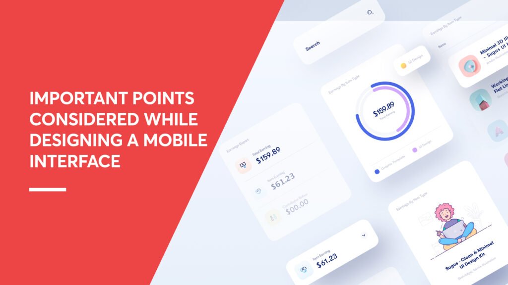
Mobile devices have become an integral part of daily life. Almost everyone relies on a smartphone to communicate, shop, browse, or access services. For businesses, this shift has made it essential to focus on mobile interface and mobile web design to connect with users effectively. A website that works well on a desktop does not automatically translate into a smooth mobile experience. Mobile web design comes with its own set of challenges and requirements that designers must carefully consider, from limited screen sizes to touch-based interactions and mobile-specific user behavior.
A primary consideration in mobile web design is user experience. Visitors should be able to navigate a website easily, find information quickly, and interact without frustration. Efficiency is key—users should reach important content without excessive scrolling or multiple clicks. Simple navigation, clear links to the home page or previous screens, and following the KISS principle (Keep It Short and Simple) ensure that the site remains intuitive. Additionally, designers should anticipate user scenarios like quick information searches or one-handed browsing, structuring content to accommodate these behaviors.
- Mobile interface design is essential for delivering a smooth user experience on smartphones.
- Understanding mobile user behavior helps create faster and more intuitive interactions.
- Efficient use of limited screen space improves usability and content accessibility.
- Gesture-based interactions should be simple, clear, and consistent.
- Prioritizing content and using progressive loading enhances performance.
- Error prevention, visual feedback, and consistency improve user satisfaction.
- Optimizing for battery, performance, and security ensures a reliable mobile experience.
Key Considerations in Mobile Interface Design
Designing for mobile is not simply about making a desktop website smaller. It requires a completely different mindset that puts the mobile user’s needs, behaviors, and limitations at the center of every decision. From how content is structured to how interactions are handled, each element must be carefully planned to ensure a smooth and intuitive UI UX Design experience.
The following points highlight the most important considerations that every designer and business should keep in mind when building an effective mobile interface:
💡 DID YOU KNOW?
More than half of global web traffic now comes from mobile devices, making mobile-first design essential, not optional.
Why Are Brand Guidelines Important?
1.Understanding Mobile User Behavior
Mobile users interact differently compared to desktop users. They often browse in short sessions, multitask, or look for quick information. Therefore, a mobile interface should support fast decision-making by presenting content clearly and reducing unnecessary steps. Designers must consider real-life scenarios such as outdoor usage, interruptions, and limited attention spans while structuring the interface.
2.Adaptive Screen Utilization
Due to limited screen space, mobile interfaces must use space efficiently. Instead of overcrowding the screen, content should adapt dynamically through collapsible sections, cards, or expandable menus. This ensures that important information is visible first, while secondary content remains easily accessible.
3.Gesture-Based Interaction Design
Mobile interfaces depend heavily on touch-based gestures such as tapping, swiping, pinching, and scrolling. These gestures should feel natural and consistent throughout the interface. Clear visual cues help users understand how to interact with different elements, reducing confusion and improving usability.
4.Error Prevention and Recovery
Errors are common on small touchscreens. An effective mobile interface minimizes mistakes by using large tap targets, confirmation messages for critical actions, and clear input validation. When errors occur, the system should help users recover quickly without causing frustration.
5.Content Prioritization and Progressive Loading
On mobile devices, not all content needs to load at once. Important information should appear first, while additional content can load gradually. This approach improves perceived performance and allows users to begin interacting with the interface immediately, which is a core principle of effective Web Development.
6.Visual Feedback and System Status
Users should always be aware of what the system is doing. Loading indicators, progress bars, and subtle animations communicate system status clearly. Such feedback reassures users that their actions are being processed, especially during slow network conditions.
7.Context-Aware Design
Mobile devices provide contextual information such as location, time, and orientation. Interfaces can use this data to enhance user experience by displaying relevant content, adjusting layouts, or offering timely suggestions. This makes the interface more intuitive and user-focused.
8.Battery and Resource Efficiency
Mobile interface design should consider device limitations such as battery life and processing power. Heavy graphics, excessive animations, and background processes can reduce performance. Efficient design helps maintain smooth functionality while conserving device resources.
9.Security Awareness Without Complexity
Security is essential, but it should not complicate the user experience. Clear permission requests, visible security indicators, and simple authentication methods help users feel safe while keeping the interface easy to use.
10.Consistency in Interaction Flow
Consistency in interaction flow helps users navigate confidently. Similar actions should produce similar outcomes across the interface. Predictable behavior reduces learning effort and improves overall usability.
Conclusion
designing an effective mobile interface requires balancing usability, speed, clarity, and aesthetics. By applying principles such as hierarchy, consistency, emphasis, and strategic spacing, businesses can develop a mobile web design that not only looks appealing but also performs seamlessly. Thoughtful mobile design improves user experience, encourages repeat visits, and gives businesses a competitive edge in today’s mobile-first world. Focusing on the needs and behaviors of mobile users ensures that your website is not only accessible but also highly effective in achieving business goals.
What is Mobile Interface Design?
What is Mobile Interface Design?
Mobile Interface Design focuses on creating user-friendly layouts and interactions for smartphones and tablets. It ensures that users can easily navigate, understand, and interact with content on smaller screens.
Why is Mobile web design important for businesses?
Why is Mobile web design important for businesses?
Mobile web design is essential because most users access websites through mobile devices. A well-designed mobile experience improves engagement, reduces bounce rates, and helps businesses convert more visitors into customers.
What are the key principles of Mobile Interface Design?
What are the key principles of Mobile Interface Design?
The main principles include simplicity, clear navigation, fast loading, and responsive layouts. Designers must focus on usability, touch interactions, and content prioritization to enhance the user experience.
How does Mobile Interface Design improve user experience?
How does Mobile Interface Design improve user experience?
A well-structured mobile interface makes it easy for users to find information quickly and interact without confusion. It reduces friction, improves accessibility, and ensures a smooth browsing experience.
What is the difference between Mobile Interface Design and Mobile web design?
What is the difference between Mobile Interface Design and Mobile web design?
Mobile Interface Design focuses on user interaction and visual layout, while mobile web design includes the overall structure, responsiveness, and performance of a website on mobile devices. Both work together to deliver a seamless experience.
How can Mobile web design increase conversions?
How can Mobile web design increase conversions?
Mobile web design improves usability and reduces loading time, making it easier for users to take action. Clear CTAs, simple navigation, and fast performance lead to higher engagement and better conversion rates.
How does responsive design relate to Mobile web design?
How does responsive design relate to Mobile web design?
Responsive design ensures that a website automatically adapts to different screen sizes and devices. It is a key part of mobile web design, helping deliver a consistent experience across smartphones, tablets, and desktops.
